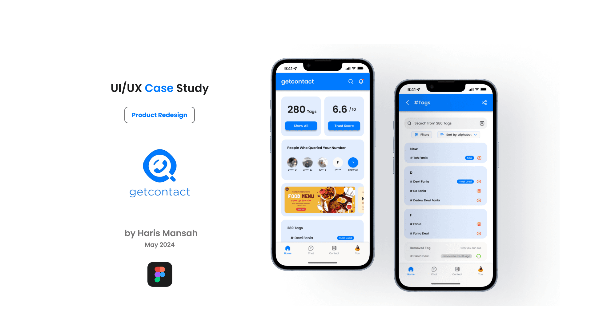
The global app need some change
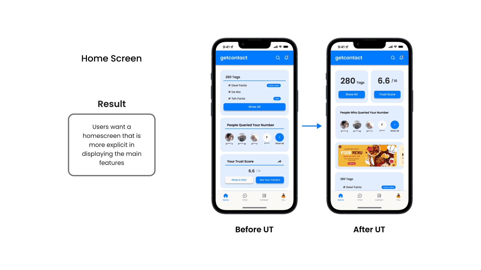
The GetContact app is redesigned to enhance both UI and UX, addressing its previous lack of user-friendly navigation and cluttered interface. The new design introduces a cleaner layout, improved readability, and intuitive interactions while maintaining GetContact’s signature brand identity. Modern visual elements, optimized spacing, and a more structured information hierarchy create a smoother and more engaging user experience. By refining usability without losing its core branding, the redesign ensures a more seamless and visually appealing way to manage caller identification and spam protection.
More understandable flow
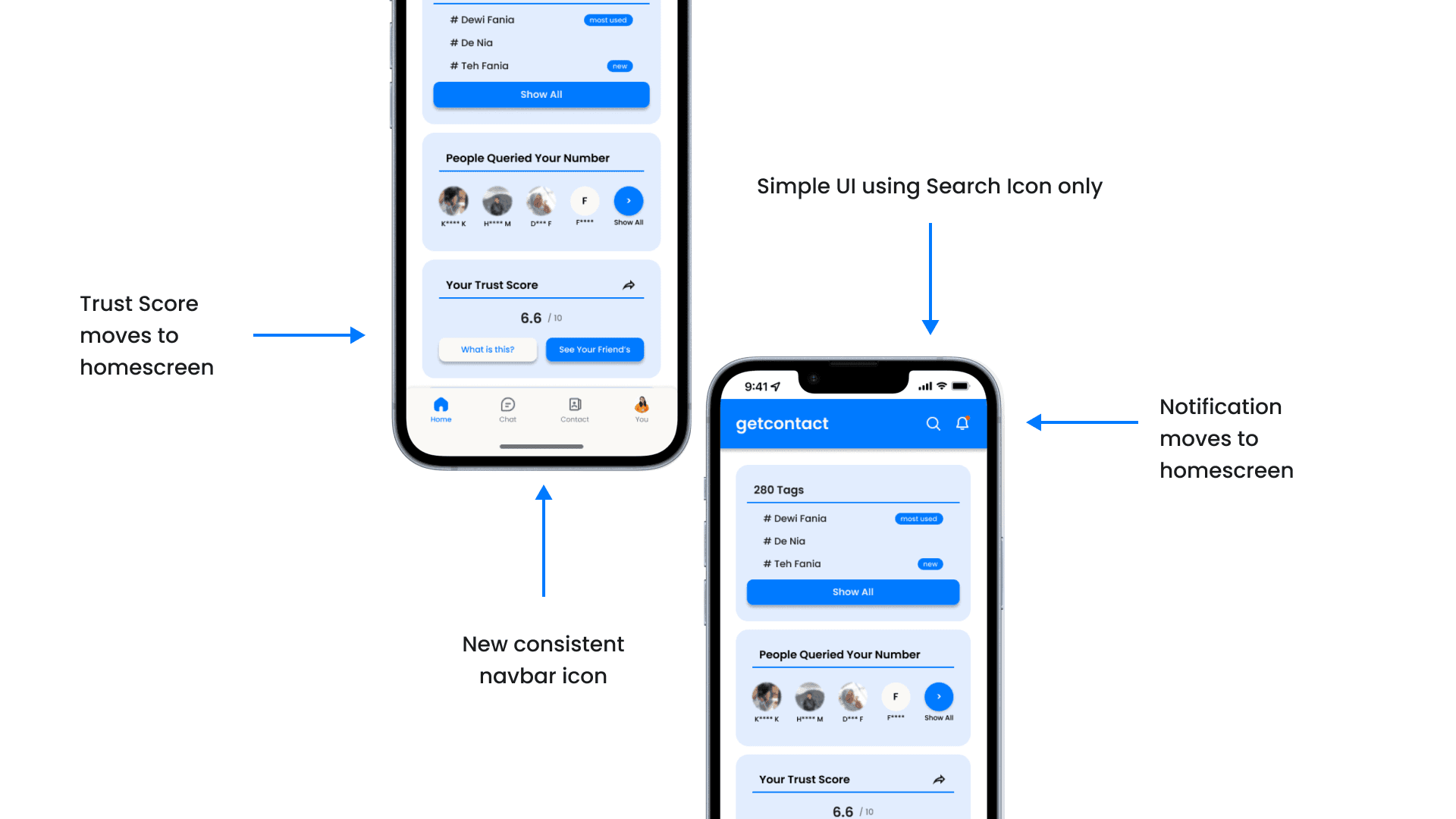
The redesign of the GetContact app focuses on optimizing user flow by prioritizing essential features on the main screen while moving less frequently used options to the background. Key actions like caller identification and spam protection are made more accessible, ensuring a smoother navigation experience. Unnecessary clutter is reduced without compromising business objectives, maintaining a balance between usability and monetization. This approach enhances efficiency, making interactions more intuitive while preserving GetContact’s core functionality and value.
Usability testing is a must
The redesign of the GetContact app is refined based on usability testing to ensure a truly user-centered experience, minimizing designer bias. Feedback from real users helps identify pain points, leading to improvements in navigation, accessibility, and overall clarity. Adjustments are made to streamline key actions, ensuring a smoother and more intuitive interaction flow. By prioritizing user needs over assumptions, the new design enhances usability while maintaining the app’s core functionality and business objectives.